WPOC
Case study
WPOCWood Pressed Oil Co.
A complete identity and packaging system for a wood-pressed oils brand — marks, labels, stationery, catalogues, and launch communication designed to feel natural, premium, and shelf-ready.
- Food & Beverage · Wood-pressed oils
- Identity · Packaging · Collateral
- Ahmedabad
- 2017
01 / Brief
Make wood-pressed oils feel like a brand, not a commodity.
WPOC needed a coherent visual system that could carry product labels, packaging mockups, stationery, price lists, and storefront communication without looking generic or overdesigned. The work spans identity through retail presence.
Wood Pressed Oil Co.
Wood-pressed oils
Brand identity & packaging
- Logo suite & brand marks
- Label & packaging system
- Stationery & collateral
- Catalogues & price lists
- Social & storefront marketing

02 / Challenge
Module / 01
Commodity shelf presence
Wood-pressed oils compete visually with crowded retail shelves. The brand needed a mark and label language that reads as crafted, not industrial.
Module / 02
Multi-SKU consistency
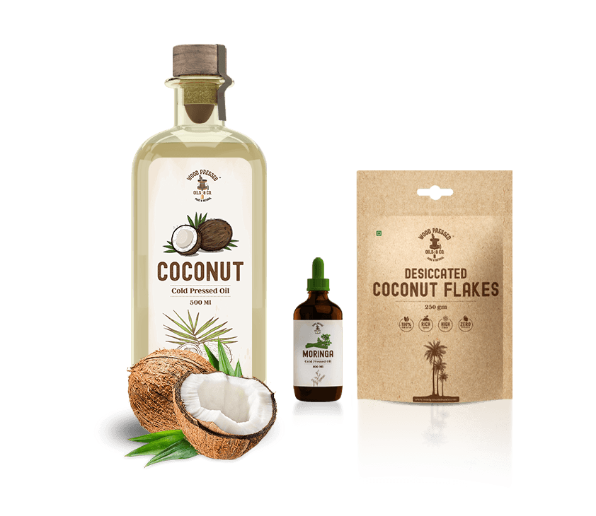
Coconut, walnut, sunflower, moringa, groundnut, and black seed oils each needed distinct labels that still feel like one family.
Module / 03
Touchpoints beyond the bottle
Stationery, catalogues, price sheets, social banners, and physical store presence had to share the same visual system.
03 / Identity
A mark built for wood-pressed craft.
Logo exploration, master mark, wordmark lockups, and presentation decks define the visual foundation — warm, grounded, and product-led.
Marks & lockups
Master mark01 / 03
Wordmark

Presentation decks
Deck · 0101 / 05
04 / Packaging
Labels and forms for every oil.
Dielines, bottle renders, craft pouches, and premium label artboards extend the identity onto the product itself.
Forms & mockups
Bottle render01 / 06
Label suite
Black seed01 / 05
Dielines & print
Groundnut01 / 07
05 / Collateral
Stationery, books, and sales sheets.
Business cards, letterheads, table books, brochures, and price lists carry the brand from desk to counter.
Stationery & books
Stationery mockup01 / 06
06 / Marketing & store
Launch presence, online and on the floor.
Social banners, flyers, invitations, storefront boards, merch, and real store photography close the system in market.
Real store
01 / 05
Development & merch
01 / 05
Close
From mark to shelf — one coherent oils brand.
WPOC now has a reusable identity and packaging language ready for product lines, retail, and ongoing communication.